2025
-
A Scottish chef based in the Netherlands was launching his premium catering service for corporate, institutional, and private events.
The brand identity needed to reflect both the culinary excellence of the service and the chef’s personal philosophy: Proud. Loyal. Bold.
Challenge: create a visual identity that conveys prestige and trust, while standing out in the luxury catering market.
-
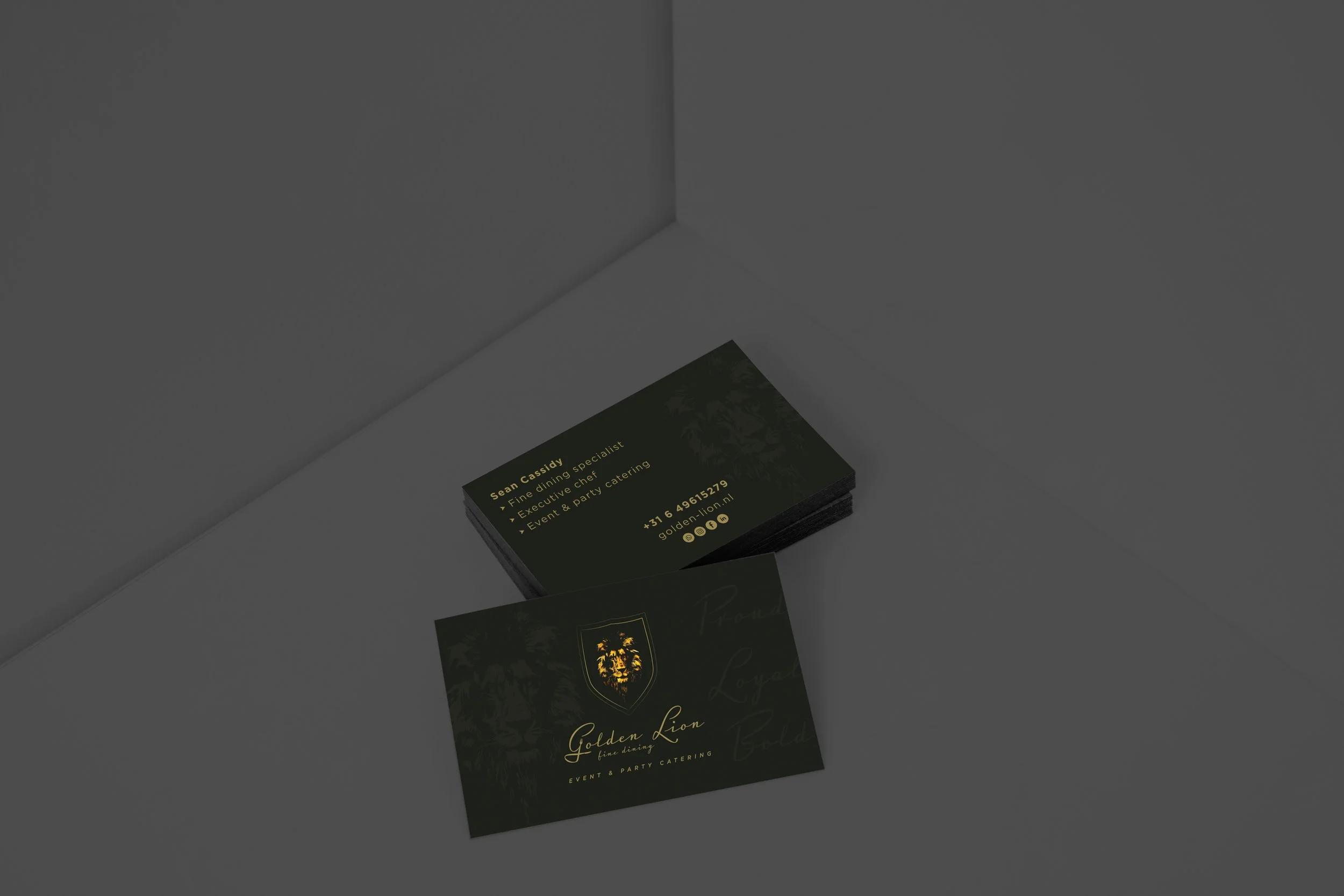
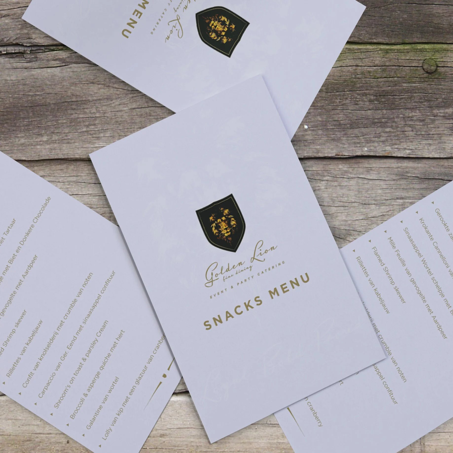
The brand is built around the metaphor of the Golden Lion – a symbol of pride, heritage, and nobility.
Lion → the chef’s personal identity, pride, and boldness.
Fork and knife in the “G” → a subtle logo detail that directly represents the culinary world and links the brand to fine dining.
Gold and black → sophistication, glamour, and exclusivity.
Handwritten typography → adds a human, artisanal touch to balance luxury with authenticity.
Heraldic shield → a subtle nod to Scottish heritage and tradition.
-
Logo: a refined emblem with elegant typography, featuring a fork-and-knife motif hidden in the “G”.
Color palette: deep black and metallic gold for strong contrast and visual impact.
Extended identity: applied across menus, packaging, uniforms, and digital materials for consistent presence.
-
The new identity positions Golden Lion as more than just catering:
A tailored fine dining experience, built on pride, loyalty, and boldness.
The branding conveys exclusivity and confidence, while staying true to the chef’s personal story and heritage.