2024
-
Silla is a jewelry brand created by a designer with a clear purpose: to celebrate female empowerment and highlight the intrinsic value of women.
The challenge was to develop a visual identity that conveys sophistication, femininity, and strength, while standing out in the contemporary jewelry market.
-
The name Silla means “strength” in Macedonian — an ideal foundation for a brand dedicated to empowering women.
Elegant minimalism → reflects the discreet luxury of signature jewelry.
Sophisticated typography → balances strength with delicacy.
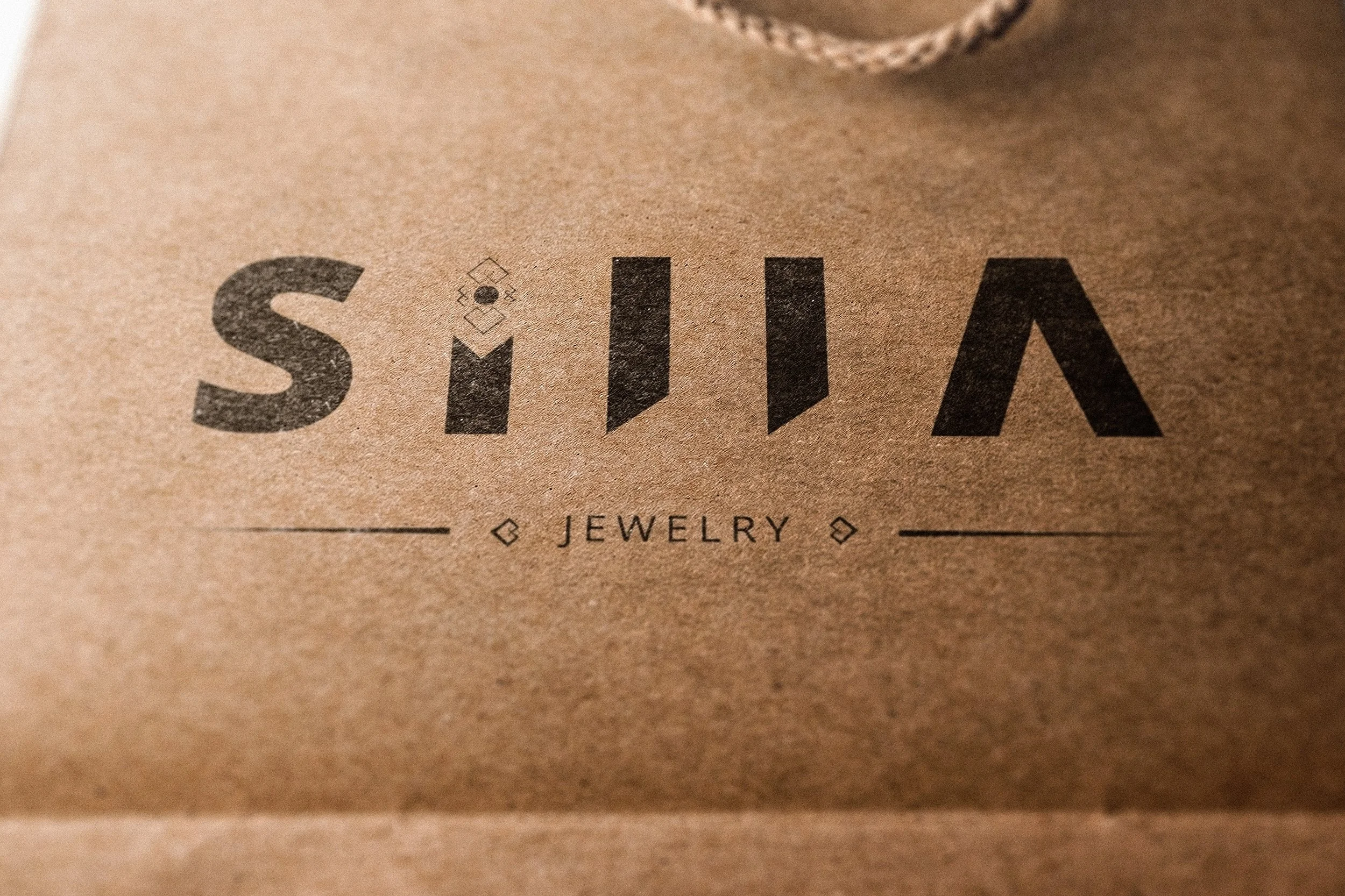
Filigree detail → the dot of the “i” was designed as a filigree motif, a subtle reference to traditional jewelry craftsmanship and attention to detail.
Monochromatic palette → black, white, and metallic accents (gold/silver) represent timeless value.
-
Logo: a clean wordmark with a distinctive filigree dot in the “i”, creating instant recognition.
Visual system: applied across packaging, authenticity certificates, and digital presence.
extended to packaging, authenticity certificates, and digital communication.
Tone of voice: modern, confident, timeless.
-
The identity positions Silla as more than just a jewelry brand:
A symbol of empowerment, confidence, and contemporary femininity.
The branding lays the foundation for a distinctive label that turns jewelry into a statement of strength and elegance.


