2020
-
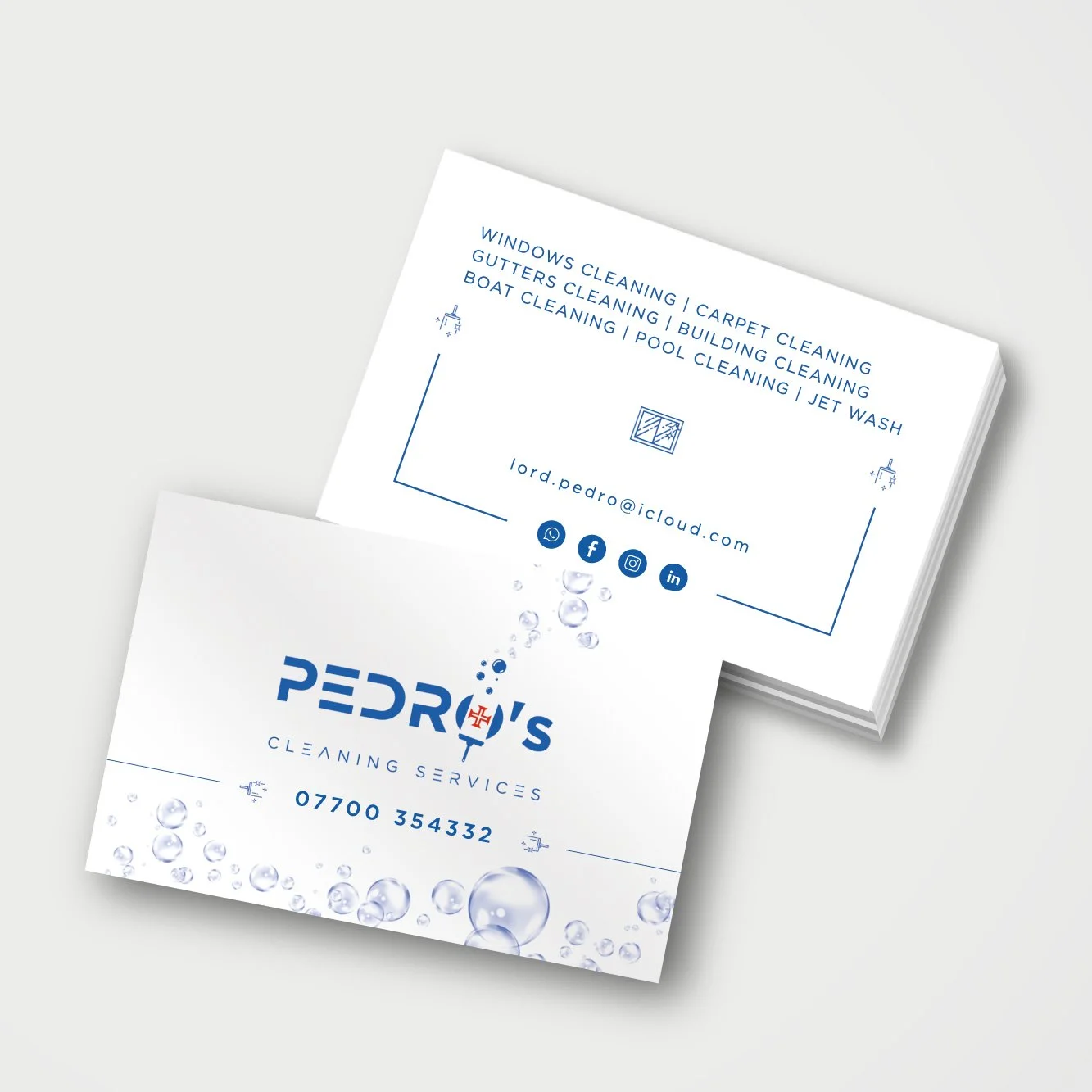
A Madeiran entrepreneur living in the UK launched his own company specializing in deep cleaning services for private properties and commercial spaces.
The goal was to create a logo that conveyed professionalism, clarity, and personal identity, while standing out in a highly competitive sector.
-
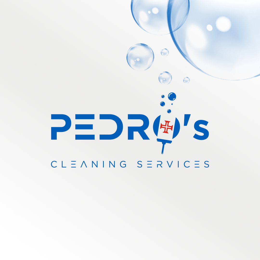
The visual identity merges the world of cleaning with Madeiran heritage, creating a strong and memorable mark:
Modern blue typography → reflects trust, freshness, and hygiene.
The “O” in Pedro → redesigned to symbolize both:
A squeegee, representing cleaning services.
The cross from Madeira’s flag, highlighting the founder’s cultural identity.
Soap bubbles → enhance the sense of freshness, efficiency, and lightness.
-
Logo: wordmark “Pedro’s” with a distinctive “O” icon, supported by bubble elements.
Visual system: designed for uniforms, service vehicles, business cards, and digital platforms.
Style: clean, modern, and instantly recognizable.
-
The identity positions Pedro’s Cleaning Services as:
A professional, efficient, and authentic company, where personal heritage adds uniqueness to the brand.
The Madeiran flag detail makes the logo not only relevant to the cleaning industry but also culturally distinctive.
![Golden-Ratio-[Pedro's-Cleaning-Services].jpg](https://images.squarespace-cdn.com/content/v1/68c476fe63444405dc14c88f/b5ee04bc-4d82-4eea-b92e-6b0ae3baef87/Golden-Ratio-%5BPedro%27s-Cleaning-Services%5D.jpg)